- Philip's Writing
- Posts
- Your checkout is too complicated.
Your checkout is too complicated.
But here's what matters: From one-page flows to trust signals.
Philip Wallage
April 17, 2025
Working with ecommerce brands every day, nearly all of them have the same problem:
Their checkout experience is costing them sales.
Not because they don’t care about UX. But because checkout gets treated like a technical necessity. Not a design opportunity.
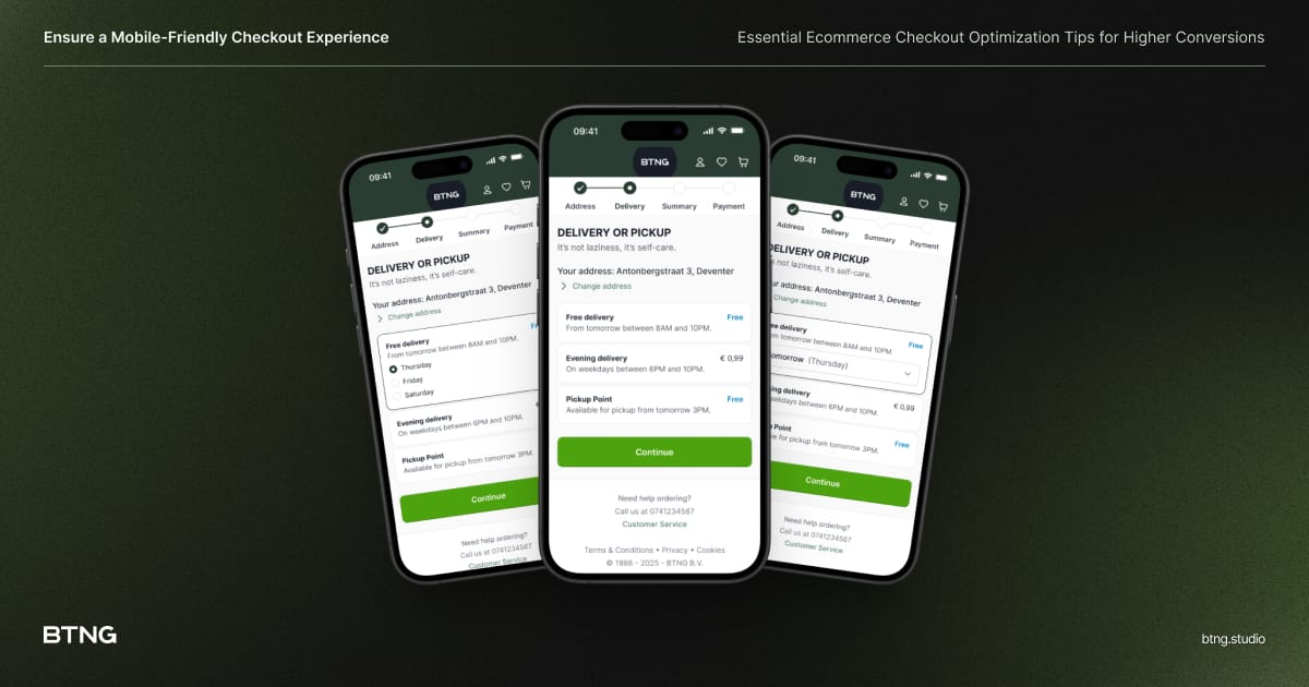
How mobile-friendly is your checkout experience?
Here’s where things get sour:
→ A clunky, multi-step checkout can tank conversions faster than bad product photography.
→ If your mobile experience isn’t sharp, your customers are already gone.
→ Requiring sign-ups before purchase? That’s still one of the biggest deal-breakers I see.
So, what actually works in 2025?
Let me give you three fast wins I’m using with clients right now:
Learn what works best. One, Two or Three step checkouts.
Give guests a break. Guest checkout isn’t a compromise on data. It’s an investment in completing the sale.
Design for confidence. Security badges, progress bars, and transparent pricing aren’t just polish—they’re trust-builders.
I’ve broken down all 12 strategies that are working this year.
From form usability to upsells in this practical guide:

These are the exact patterns I use at BTNG to help brands reduce friction and lift revenue without overhauling their tech stack.
If you’re wondering where your checkout is leaking…
Reply and I’ll tell you the first thing I’d fix.
With kind regards / 🇳🇱 Met vriendelijke groet,

Philip Wallage — BTNG.studio
Experience World-Class UX Design — every month
🛄 Don’t be a stranger — find me on LinkedIn to stay connected!
👉 Heads up, fellow human: I hit 'send' when it fits my schedule, even if that's not 9-to-5. No stress if you're off the clock — reply whenever you like, no rush!